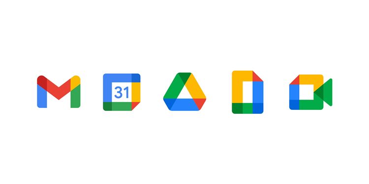
Gmail by Google is one of the most popular email services available on the web. For many weeks, the company had hinted about the new look of the logo. After a number of speculations, the new logo by Gmail is finally out. Apart from the new logo, the search engine has also given a new name for its G Suit collection of apps and is known as Google Workspace.
The new look of Gmail is brought it much closer and in line with the rest of Google Workspace. Talking about the new logo design it can be clearly seen that the design inspiration has been taken from the existing logos of Google Maps, Photos, Drive and others. The new ‘M’ has the signature colors, red, blue, green and yellow. With the new logo, it has given up the earlier red and white envelop and has only kept the letter M.
The new logo seems consistent of the Google’s existing icons, but the new logo has not gone down well with all the users. A number of users have taken their respective social media accounts and have expressed disappointment over the new logo and have said that it looks similar to the other logos of Google and might even be mistaken for the other services. The new logo of Gmail is a minimal version of the existing logo and has a single design element. However, there is also a group that has appreciated the new logo for being simple, clean and colorful and a contemporary take on the original logo.
The problem only begins when it is placed with the other Google Workspace logos. Google has explained and said that the new design is a more connected, flexible and a helpful experience for the users and has been kept similar due to the fact that they belong to the same family afterall. The search engine had earlier teased about the new logo and had received a wrath of the users then as well.
Photo Credits: 9to5 Google


