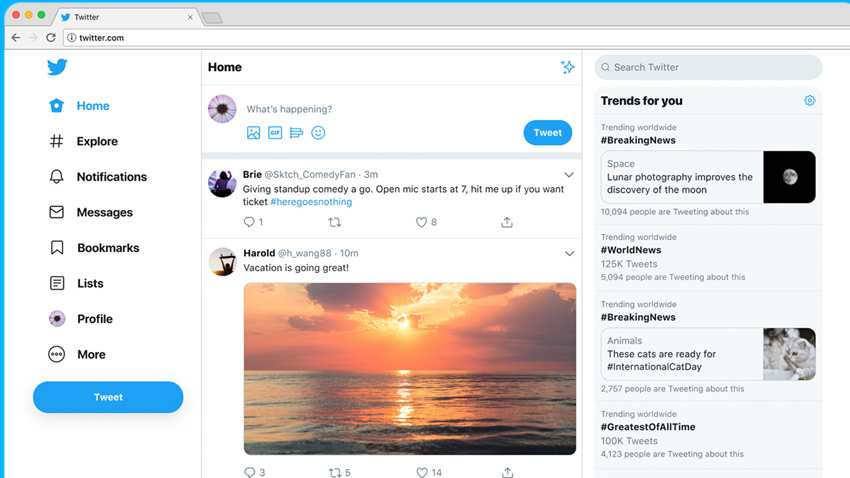
Micro blogging site Twitter has launched its first major website redesign in seven years. It is a subtly streamlines experience that is more in line with the company’s app. As of July 15, 2019, the desktop site is for all the users and has a responsive design that can shrink down to a simple tweet stream. The new feature has a rejigged side navigation that also has bookmarks and lists along with more options for the popular dark mode display that replaces white as the dominant background with a darker tone.
The actual goal behind the fresh changes in consistency as the social networking site has been having the old look since a long time next to its native iOS and Android apps. The new layout and functionality is significant but Twitter’s designers said that the actual extent of the changes is hidden under the hood. As a part of the project, the makers have moved a new technical stack which means the underlying frameworks and programming languages are more suited to the demands of contemporary web design.
The lead designer of Twitter on the project said, “This was built from the ground up. And it’s something that is going to be much easier for us to build new features on, experiment with new features on, and it will get them out to our customers much quicker.” Mike Kruzeniski, the head of design and research at Twitter had described the redesign as the company’s worst kept secret. There was a time when they had tried to keep the news under wraps but now they value a slow rollout with extensive testing. This means that the users were aware of what was coming.
Kruzeniski added that he is thankful to the investment in the research and data science. The design and research head added that as a company they have become a lot smarter over years.
Photo Credits: Zee business


