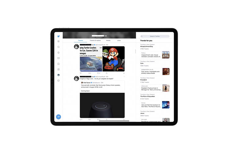
Popular micro-blogging site Twitter will soon have an update for its official Twitter for iPad app. The app will have a new design interface which was awaited since long. The recent updates released by the micro-blogging site is the best for the added screen real estate which is available on the iPad. Twitter for iPad will now have a convenient multi-column view that allows the users to see a little more information.
So far the Twitter for iPad had only a single timeline of content which is surrounded by just white space on both sides. Due to this it was noticed that plenty of space was wasted and it was more noticeable on the landscape mode. The new design now makes the micro-blogging site more like Twitter web app. The menu bar can now be found on the side. Earlier, the menu bar was found on the bottom of the timeline. The users can now also find trending topics on the other side of the timeline along with other dynamic content.
Improvements have been made but a little more improvements for the iPad version will make it more user friendly. For example, if the users are given the ability to customize the different columns that would be an added benefit. It can include support for one column with the timeline and another column with what the users want. Such features are right now available with Tweetdeck, but the micro-blogging site has so far not added such features to the standard app. Despite the drawbacks, the new iPad interface is much better that what it was earlier.
The updated version is rolling out in a random manner. If some of the users are not able to see the new update, then they do not have to worry as the rollout is being made in a gradual way and they might get it in a few days.
Photo Credits: Beebom


