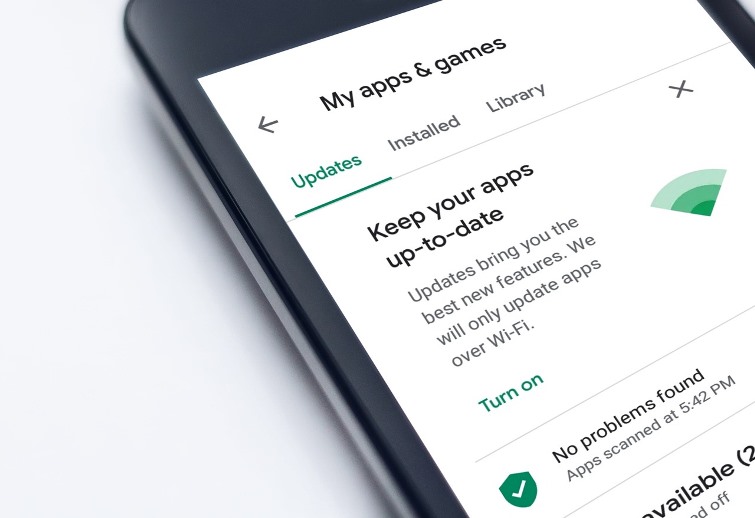
Play Store by Google is now looking forward to a number of ways to keep their users intact. In the month of October, the company had launched Material You redesign which was straight and only touched the home screens. Now the search engine giant is adding ‘Offers’ tab for the Play Store that will be found on the bottom bar. Many people have four tabs at the bottom bar of the Play Store. Users who subscribe to Play Pass, it grows to five.
Now the default can become five tabs for all the users with the ‘Offers’ tab that will be placed between the ‘Apps’ and ‘Movies & TV’ tab. It makes use of a standard price tag icon which would result in six items but it is expected that Google might move Play Pass in that case. The icon will be showing the subscribers offers for the apps that the users might be interested in. It will also include the relevant Games.
The users can see the carousels that have cover images and display the deal which is in question along with the expiry date along with some standard app information that appears below. The name could be familiar, but that is different from the Offers and Notifications page on the app menu. It is close to the cards that display the Limited time events in the game on the Games feed. Despite the changes, it cannot be said at the moment if the changes would anyway benefit the users but the developers will be having a surface that will be more prominent than the app listings.
Coming back to the Offer’s tab for the Google Play Store it is not yet widely rolled out for the devices. So far only one such report has been seen so far and it is still not clear if it is a test or is a feature that has been finalized as no solid benefits can be seen for now.
Photo Credits: Pixabay


